
In this lesson, we are going to review most of the design aspects and layout elements that should be included in your blog, explaining how you can optimize them to make sure that your blog will achieve its goals.
1. Setting Priorities
There are literally hundreds of things that you could want visitors of your blog to do. Examples include:
- read at least one post,
- read as many posts as possible,
- read your most popular posts,
- subscribe to the RSS feed,
- subscribe to the email newsletter,
- click on affiliate links and make a purchase,
- click on ads,
- submit a post to a social bookmarking site,
- check your profile on social networks,
- check the blogs on your Blogroll,
- leave a comment,
- bookmark your website on the browser,
- email one of your posts to a friend,
- download your ebook, and
- purchase your product.
Unfortunately, it is not possible to design a blog in a way that all of those things will be encouraged. Some people try, but the result is a lot of clutter that only confuses visitors, creating a terrible user experience. This means that you will need to prioritize. I recommend that you write down five top priorities, and then design the elements of your blog around these priorities.
Whatever does not support the priorities should be removed, or at least moved to a place where it won’t get in the way of the user experience (e.g., the footer). Obviously, the number five is just a rule of thumb, so feel free to change it. The key message is, the fewer things you “ask” your visitors to do, the higher the chances that they will actually do them.
2. The Logo
Most western societies read from left to right, so the top left spot of any website is usually the first thing that people will pay attention to. If you put your logo on that position, therefore, you will be maximizing its exposure and giving a natural flow to the elements on your header. The second choice is a centered logo.
It is also a good idea to make the logo itself linked to the homepage of your site. This is a widely used practice among webmasters, and many Internet surfers are used to clicking on the logo when they want to go back to the homepage of a site.
3. The Space Above the Fold
The expressions “above the fold” was coined in the printing industry to refer to the content that would be displayed on the first half of the newspapers, as most of them are delivered folded. That content was particularly important because it would be responsible for enticing people to read and buy the paper. The same principle applies to websites, where “above the fold” is the section of your site that can be seen without the need to scroll down. That section is the most important one because it will “sell” your website to
The same principle applies to websites, where “above the fold” is the section of your site that can be seen without the need to scroll down. That section is the most important one because it will “sell” your website to first-time visitors.
Many people end up using giant headers with fancy graphics on their website, shifting the main content below the fold. This is obviously a mistake because it forces the users to scroll down before they can actually see the part that they are looking for.
Ideally, therefore, you should put as much useful content above the fold as possible. Consider what are the elements that the visitor must see right away on your site (e.g., post headlines, RSS icon, navigation menu), and make sure that they are appearing above the fold.
4. Theme Width
As we mentioned in the previous point, it is essential to put as much useful content above the fold as possible. If you select a narrow theme for your blog, therefore, you will be losing some valuable space right from the start.
What is considered to be narrow? Anything with 800 or fewer pixels. Statistics from w3schools.com confirm that in January 2009 you had 93% of the Internet population using a 1024×768 or higher monitor resolution. You can safely assume then that the majority of your visitors will be able to load 1000-pixel wide designs without problems.
4. The Subscription Section
One of the main goals for any blog is to attract as many RSS and email subscribers as possible. Those subscribers will receive your new content whenever you publish it, and therefore, represent a guaranteed audience.
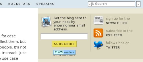
You might use several subscription sections inside your blog, but one of them must be located above the fold. In fact, there are three spots that you should consider using for that purpose: the header, the navigation bar and the top of the sidebar.
Make sure that visitors will also be able to identify the subscription options easily. You could use an RSS icon, an email subscription icon, an email subscription form, or a combination of them.
6. Popular Posts Section
Convincing first-time visitors that your blog is worth their time is a hard task. One technique that you can use for that purpose is to have a section in your blog that highlights some of your best content. You could call it “Popular Posts” or “Most Read.”
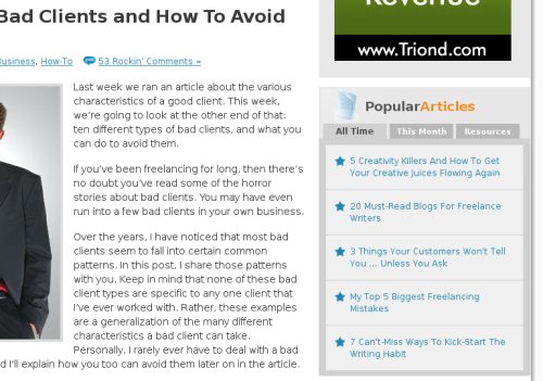
There are several ways to create that section. One of them is to use a plugin that will sort the popular posts automatically for you. The WordPress Popular Posts plugin, for example, allows you to sort your posts according to comment count, total page views or average daily page views.
Another way is to choose the posts that you want to display to first time visitors, regardless of how many page views they have, and to manually create that section in the sidebar of your blog.
7. Post Dates
Whether you like it or not, most people will perceive old posts as less relevant and less accurate content. And that is regardless of the actual quality of those posts.
If you write evergreen content in your blog (e.g., how-to articles and tutorials), therefore, you should consider displaying the post date below the post content, as opposed to displaying it along with the post title as many blogs do. If the post date comes after the content, you will remove the risk that some people will skip your post altogether just because it was written some time ago.
Some bloggers take this strategy one step further and remove the dates from single post pages completely (while leaving them on the homepage, to make sure first-time visitors will be able to see the posting frequency of the blog). One example is Copyblogger.com.
8. Social Bookmarking Icons
One misconception about social bookmarking icons is the fact that they increase the chances of a website going popular inside social bookmarking sites like Digg, StumbleUpon or Delicious. If you check the front page of those sites, you will notice that not even half of the stories that go popular are displaying those icons.
If users want to Digg or bookmark your article on Delicious, they will do it whether you have social bookmarking icons or not. If you like to have a clean design, therefore, you can avoid those icons and don’t worry too much about it.
That being said, there are some occasions where the social bookmarking icons can help. If you have a large and active audience, for example, the icons could remind and encourage your loyal readers to vote for your articles on those social sites.
Secondly, if you have an article that is really good and that is already receiving votes on a particular social site, displaying a voting button for that particular site could improve your chances of going to the first page. Here is the page of the one of the main social bookmarking site where you can get the code to display a button on your site:
Finally, for people that want to offer the social bookmark functionality while keeping the design as clean as possible, there is a wide range of widgets and plugins that will add a simple button or badge to your site, and when the user hovers his mouse on it, a wide range of bookmarking options will appear. Two examples are the ShareThis and AddThis widgets.
9. The Section Below Single Posts
The section below your single posts is one of the most important on the blog. Why? Because your visitors will be in a different mindset after they are done reading your articles. For example, the chances of a random visitor subscribing to your RSS feed right after coming to your blog are much smaller than the chances of a random visitor subscribing after he is done reading one of your articles.
Secondly, this section is also important because after the visitor is done reading your article, he will look for something to do next. If you don’t offer any options to that visitor, he will probably browse somewhere else, so it is important to have call to action placed on that spot.
There are basically four things that you can use below your single posts, two of which are essential, and two of which are optional.
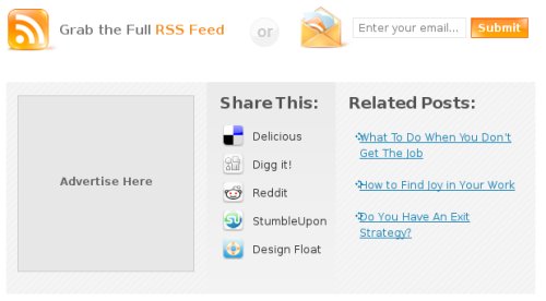
The essential ones are a subscription section and a “Related Posts” section. The first one aims to attract as many subscribers as possible while the second one aims to get your visitors flipping through many articles and pages inside your site before they leave.
The optional features are the social bookmarking icons and an advertising spot. If you want to see an example of a blog integrating all those four things below single posts, head to FreelanceFolder.com.
10. The Footer
The footer is another section of your blog that should be optimized, and that goes beyond placing a copyright notice there. For the matter of fact, you aren’t even required to display such a notice in order to protect your copyrights.
One useful inclusion on the footer are the main navigation links. You could include a link back to the homepage, a link to your about page, a link to the contact form and a link to the RSS feed. Should some of your web pages become long, those links will save a lot of scrolling for your visitors and improve the overall experience.
Many blog themes already come with styled footers as well, where you can edit the theme file or use widgets to add any of the following things:
- A brief information about the blog and its purpose
- A brief information about you or the authors of the blog
- Links to your social media accounts and profiles
- A list with the recent posts
- A list with the recent comments
- Link to related resources
- Affiliate links
A good way to determine what should be included in your footer is to think about the elements that you want to display to your visitors, but that are not important to deserve a spot above the fold or on the sidebar.
Action Points
Go through the points mentioned in this lesson and make sure to apply them to your own blog design and layout elements.
If you are not sure about one specific point, the best idea is always to test, track the results and user feedback, and then settle on a final decision.
Navigation Links
Previous Lesson: Blog Content Strategy
Next Lesson: Networking Strategy